图片提示词prompt
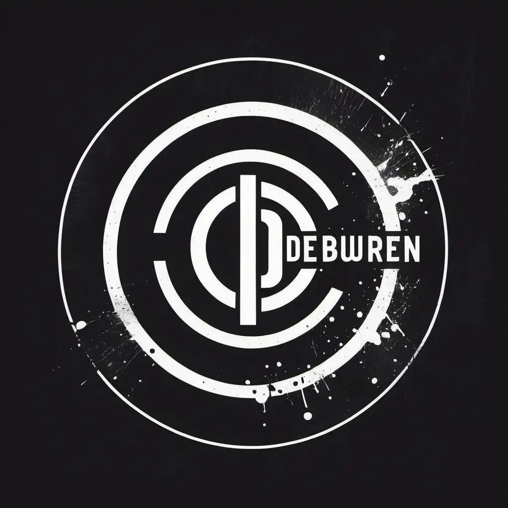
(accurately spelled text "De Overburen"), logo design, (grunge style), circular format, clean and simple, bold typography, monochrome palette, rough textures, edgy elements, minimalist design, high contrast, no colors outside circle, suitable for rock band identity, appealing to music lovers, professional and modern presentation.
(精确拼写的文本“De Overburen”),标志设计,(垃圾摇滚风格),圆形格式,干净简洁,大胆的排版,单色调色板,粗糙的纹理,前卫的元素,极简主义设计,高对比度,圆圈外没有颜色,适合摇滚乐队的身份,吸引音乐爱好者,专业而现代的呈现方式。
生成参数
使用模型
模型分类
prompHero 更多作品