图片提示词prompt
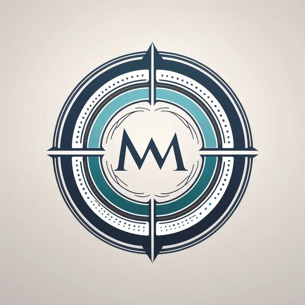
“A modern, intricate logo for a company called ‘Midway Solutions,’ specializing in business mediation and connecting stakeholders. The design features a dynamic circular emblem made of interlocking arcs, lines, and dots, symbolizing networks, balance, and collaboration. The emblem incorporates subtle gradients and layered elements for depth and complexity. The color palette includes blue (dominant, for trust and professionalism), gray (neutrality and sophistication), and orange accents (energy and innovation). Clean, sans-serif typography for the company name, with ‘Midway’ slightly more prominent than ‘Solutions.’ Flat design on a solid white or light-gray background.”
“一家名为 'Midway Solutions '的公司的现代,复杂的徽标,专门从事业务调解和连接利益相关者。该设计具有动态的圆形标志,由互锁的弧线,线条和点组成,象征着网络,平衡和协作。标志结合了微妙的梯度和分层元素的深度和复杂性。调色板包括蓝色 (占主导地位
生成参数
使用模型
模型分类
prompHero 更多作品